Images / PRACTICAL GUIDE
Midjourney: prepare a poster illustration in three formats
A portrait poster, a square card and a wide banner call for different subject placement. Learn when a crop will work and when the composition needs a fresh start.
Sketch three layouts before choosing an image
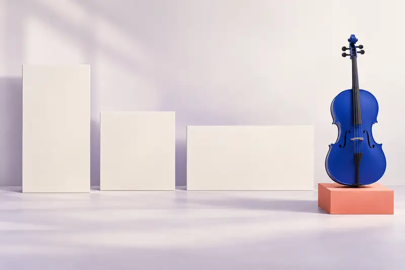
A chamber music evening needs a portrait poster, a square card and a wide banner. Each should feature a recognisable cello, a light background and a prominent headline. Start with a striking image and no layout, and you may face an awkward choice at the last minute: crop off the neck, shrink the instrument to a speck or place the title over its strings.
Before generating anything, draw three empty frames and add the actual copy: the title, time, place and what you want the reader to do. Set this text in your layout editor for now. You can then see how much room it needs and where the illustration can carry more detail. Three rough layouts will do more for this task than a long list of attractive adjectives.
- 2:3 poster: headline and event details at the top, instrument below; leave space around the edges.
- 1:1 card: a short headline beside the main subject; smaller details can go in the post caption.
- 16:9 banner: headline on the left, cello on the right; check early that the button does not need the same space.
Aspect ratio does not specify file dimensions
In Midjourney, --ar sets the ratio of width to height. Use --ar 2:3 for the poster, --ar 1:1 for the square and --ar 16:9 for the banner. Place the parameter at the end of the description. It does not guarantee a particular pixel count: the final dimensions also depend on the model and upscaling tools. Check the actual file once you have it.
Do not enter a size such as “1200 pixels” in place of an aspect ratio, or assume that changing only --ar will preserve every detail’s position. The same object occupies a narrow frame differently from a wide one. Check the version and ratio settings in the interface you are using: a parameter’s presence in the official documentation does not establish which controls that interface provides.
One visual brief, three compositions
The shared brief is short: a cobalt-blue cello, a small coral-coloured stand, a matt paper texture and a quiet, light background. Repeat the subject description and medium. Change the instrument’s scale and position, and the space reserved for text. This gives you a starting point for three separate prompts; it does not promise an identical instrument down to the last string.
EXAMPLE PROMPT
Editorial illustration for a chamber concert: a complete cobalt-blue cello in the lower part of the frame on a small coral-coloured stand, a light plain background, the upper third is quiet open space for a headline, matt paper texture, soft side lighting --ar 2:3
Scale matters in a square; direction matters in a banner
In a square card, a long title may take up almost as much room as the instrument. Remove secondary objects from the scene and try the actual typeset copy. If the neck becomes too thin when the image is reduced, keeping the instrument recognisable matters more than matching its scale precisely to the poster.
EXAMPLE PROMPT
Editorial illustration for a chamber concert: a complete cobalt-blue cello to the right of centre on a small coral-coloured stand, quiet open space on the left for a short headline, a light plain background, matt paper texture, soft side lighting --ar 1:1
Build the wide composition around the headline
For the banner, place the instrument on the right and ask for a simple, light surface on the left. “Open space” need not mean a total absence of texture: it is enough to keep high-contrast details from competing with the letters. Add the exact copy, logo and button as separate layers in the layout so you can adjust them without generating the whole scene again.
EXAMPLE PROMPT
Wide editorial illustration for a chamber concert: a complete cobalt-blue cello near the right edge on a small coral-coloured stand, a broad quiet light area on the left for a headline and button, matt paper texture, soft side lighting --ar 16:9
Check the crop with simple numbers
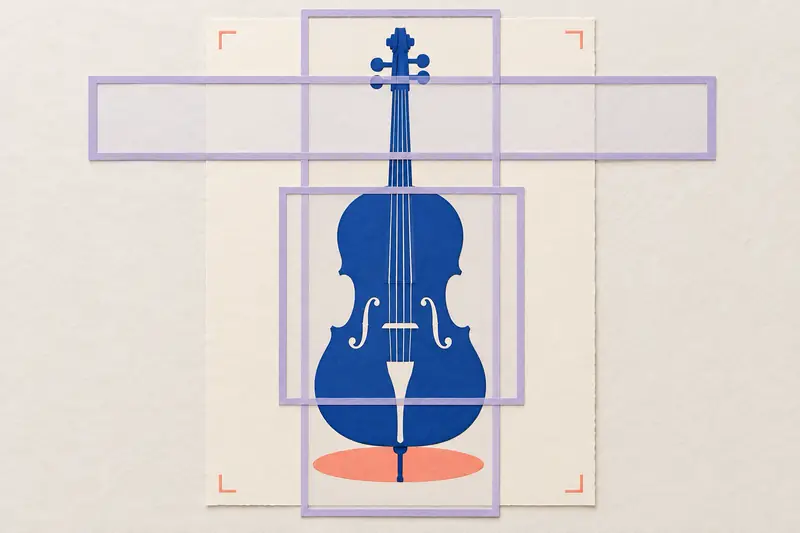
Suppose the original square image measures 1200×1200 pixels. A centred 2:3 crop that keeps the full height leaves 800×1200: 200 pixels are removed from each side. A 16:9 crop that keeps the full width leaves 1200×675, removing 525 pixels in total from the top and bottom. In a raster crop, split these into 262 and 263 pixels, or shift the frame slightly.
This is a geometry calculation for the chosen example, not a claim about the dimensions Midjourney returns. Overlay these frames on your image in an editor without stretching it. If the portrait frame cuts into the body and the wide frame cuts off the neck, moving the headline will not rescue the original composition. Choose another version or prepare a separate image with the required proportions.
Even a workable centred crop says nothing about text placement. The poster may need the upper area for its headline; the banner may need the left. Check the entire layout, including its margins, rather than merely keeping the object inside a rectangle. For print, agree the size, resolution and bleed with the printer separately: --ar does not specify those requirements.
Choose images at their publication size
Open the three layouts side by side and reduce them to the size the reader will see. The main subject and event title should remain clear; assess the extra information separately. Then enlarge the illustrations and inspect the neck, strings, stand and subject edges: a strong silhouette does not make accidentally fused details acceptable.
- The subject is recognisable in all three formats, but need not occupy the same percentage of each image.
- The headline fits with its actual line breaks and does not cover an important part of the instrument.
- At the reduced size, the background behind the lettering remains quiet and the text stays legible.
- No detail essential to the scene’s meaning falls outside the final frame.
- Each file is saved with its prompt, model version, chosen settings and approved layout.
When to stop cropping and change the composition
If every crop demands another compromise, stop trying to salvage a single image. Keep it as a colour and texture reference, then specify a different subject position in a separate prompt for the troublesome format. Related colours and a clear scene matter more than identical shadows.
For the concert set, judge the result as three finished layouts containing the real copy. One successful portrait image does not solve the banner. Save the frames and short shared brief for the next event: you can then change the composition deliberately, instead of hunting for gaps between incidental details.